Branding for Susanne Spahn
Susanne Spahn is a classically trained singer, a teacher for the Alexander Technique and an activist for gender and race equality. Together we worked on a Branding that reflects all these aspects. That is vivid and adaptable yet distincted. For her Alexander Technique studio she already had a beautiful logo and a website. The challenge was to create a Branding for her as a singer that goes well with her established elements, yet is new and fitting for her music. In the end we found a solution that brings everything together in harmony.
Moodboard
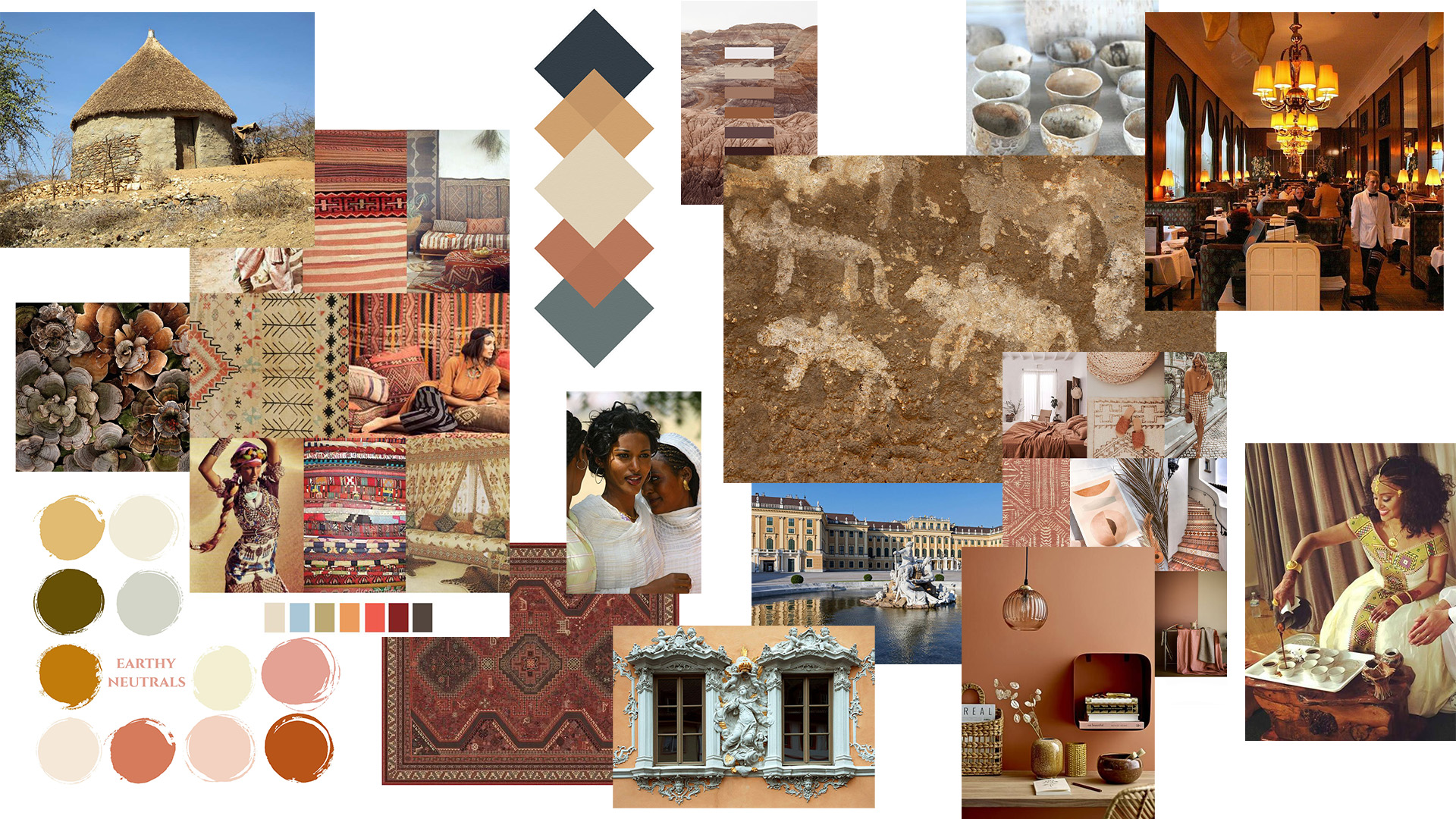
In preparation to select branding colors we created a moodboard. To create the moodboard, we took inspiration from her personal and artistic background. We chose an earthy, warm and elegant set of colors to make reference to her afro-german background. Susanne studied voice in Vienna and the classy interiors of ancient Viennese coffee houses influenced the selection of our branding colors too. As well as her singing voice did – a warm, earthy mezzo-soprano with some bright soprano notes.
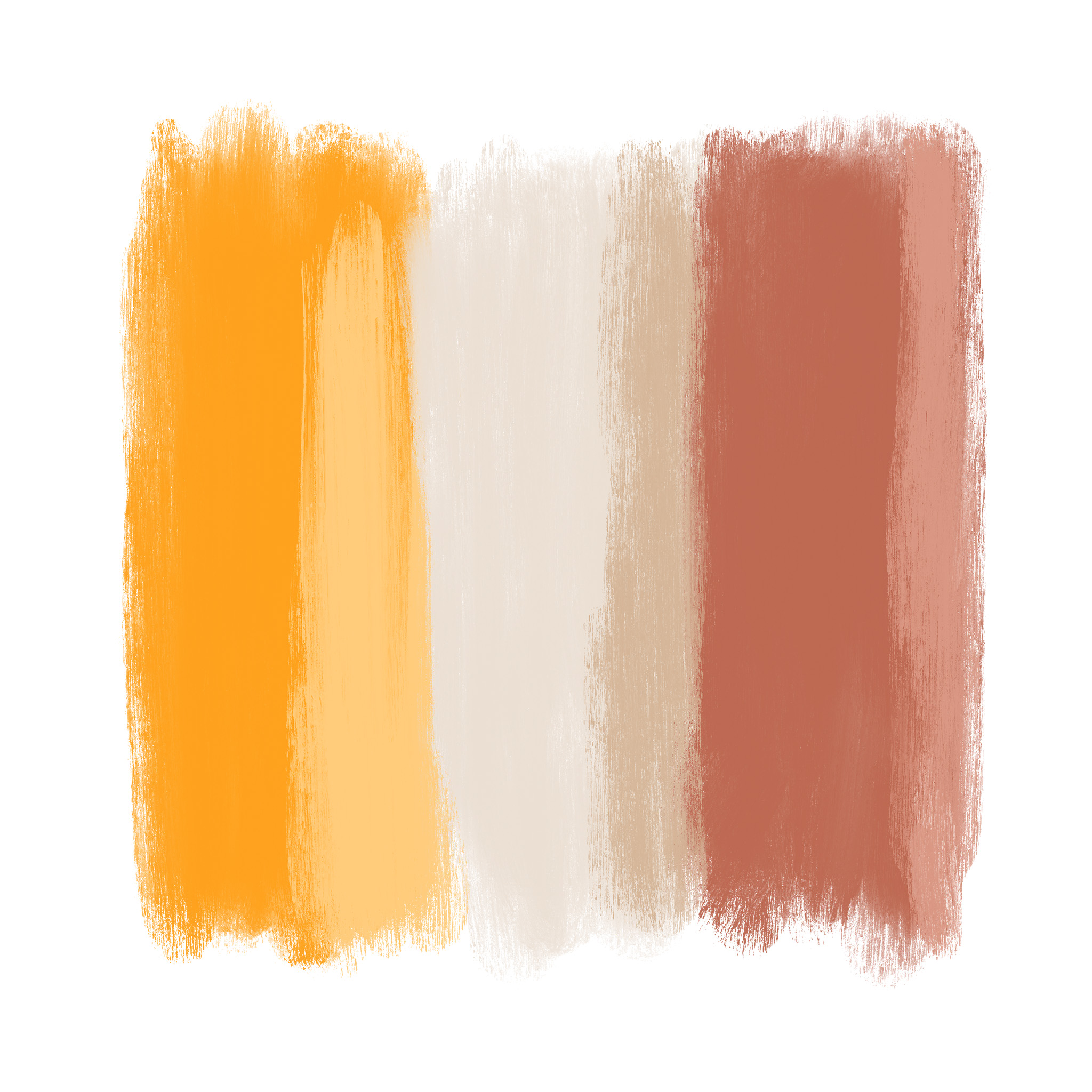
Colour Palette
I turned the thoughts of the moodboard into a harmonious, earthy color palette. Sophisticated, distinct and adaptable it carries her messages.

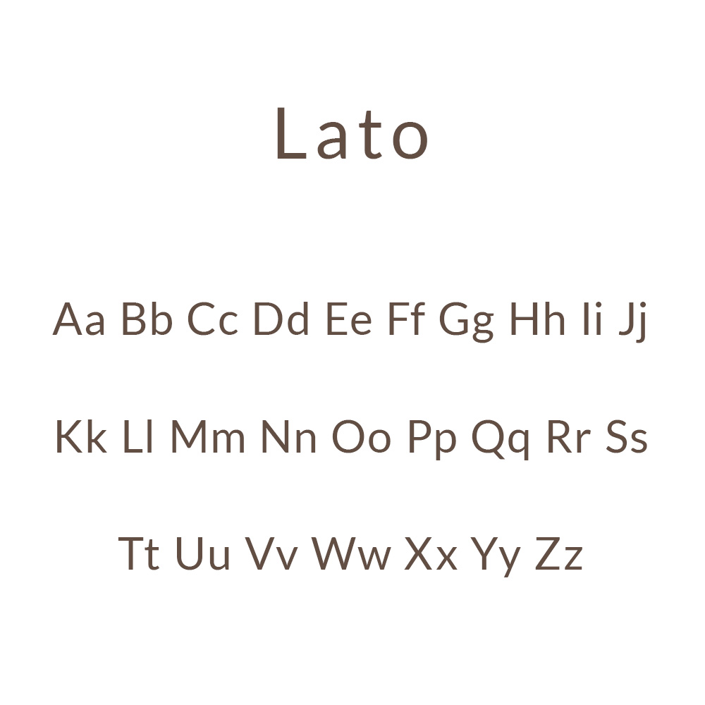
Font Selection
For her communication about Alexander Technique we kept “Lato” – a factual and modern sans serif.
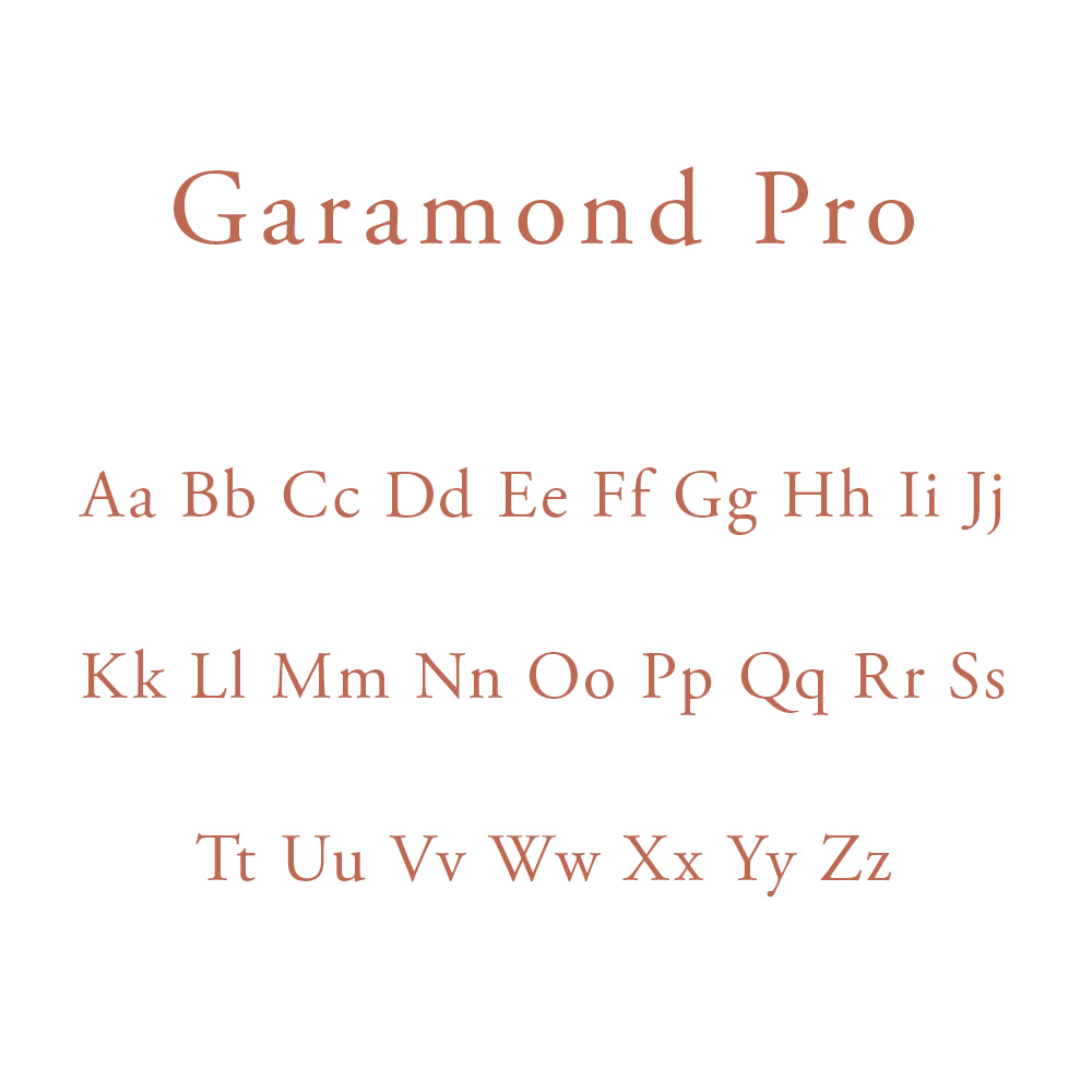
But for her communication as a singer we chose Garamond Pro – a slightly modernised version of a timeless classic serif font.
Key Imagery
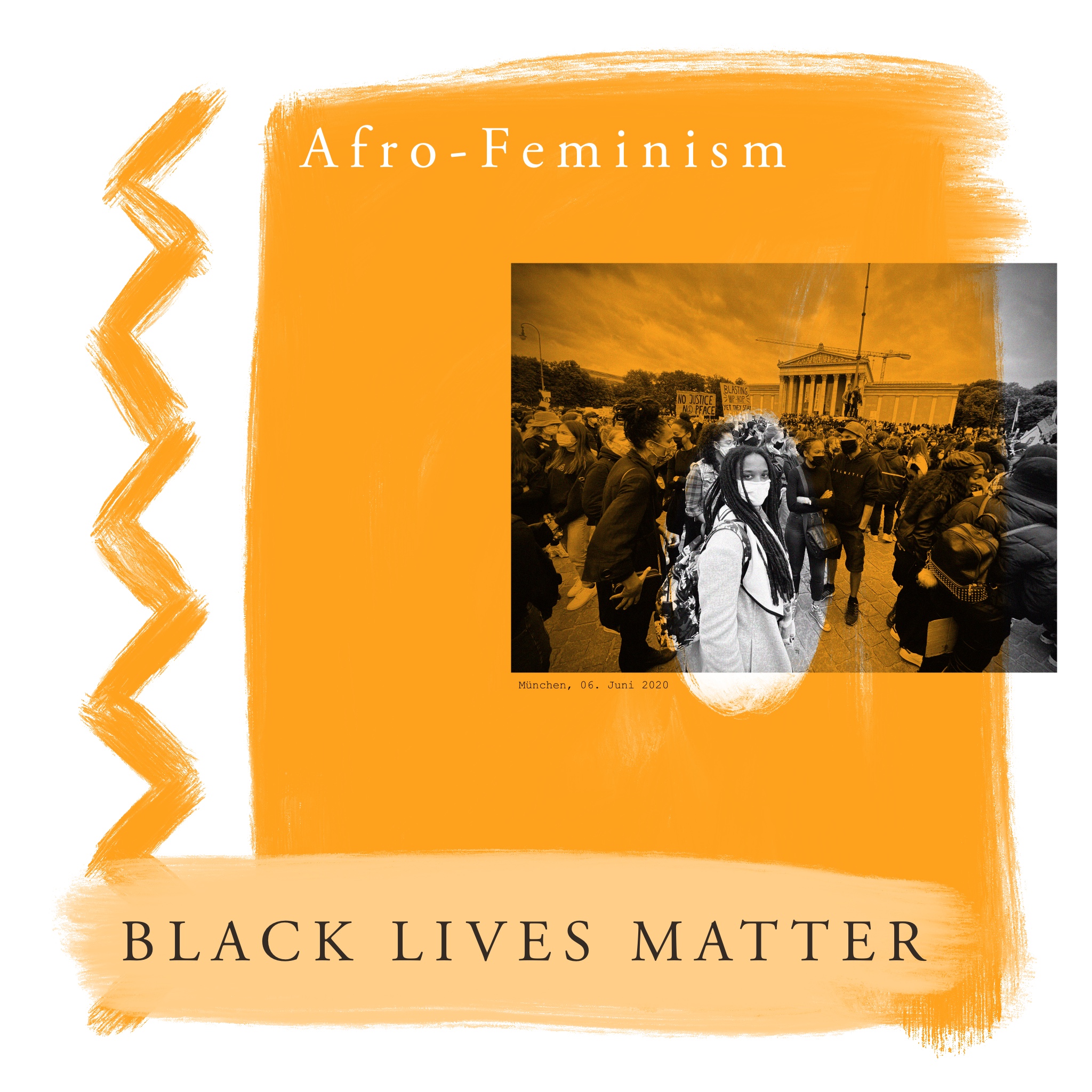

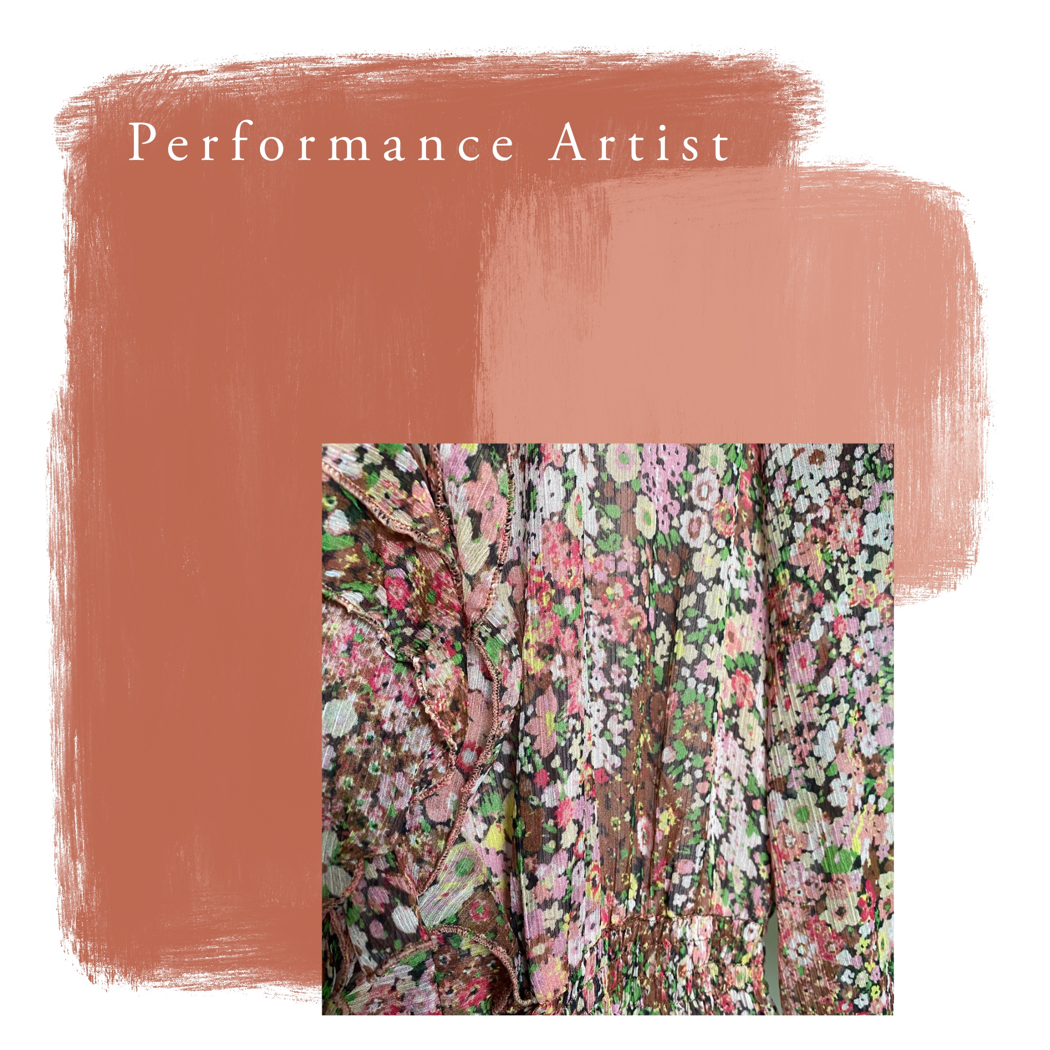
We used her colour palette to color code her topics. Also we used a slightly different tone regarding the images. We used the bold yellow in combination with black and white photos to speak about afro-feminism. The communication about Alexander Technique is in gentle and bright neutrals. And to show Susanne Spahn as a performance artist we used earthy reds.
Logo Design
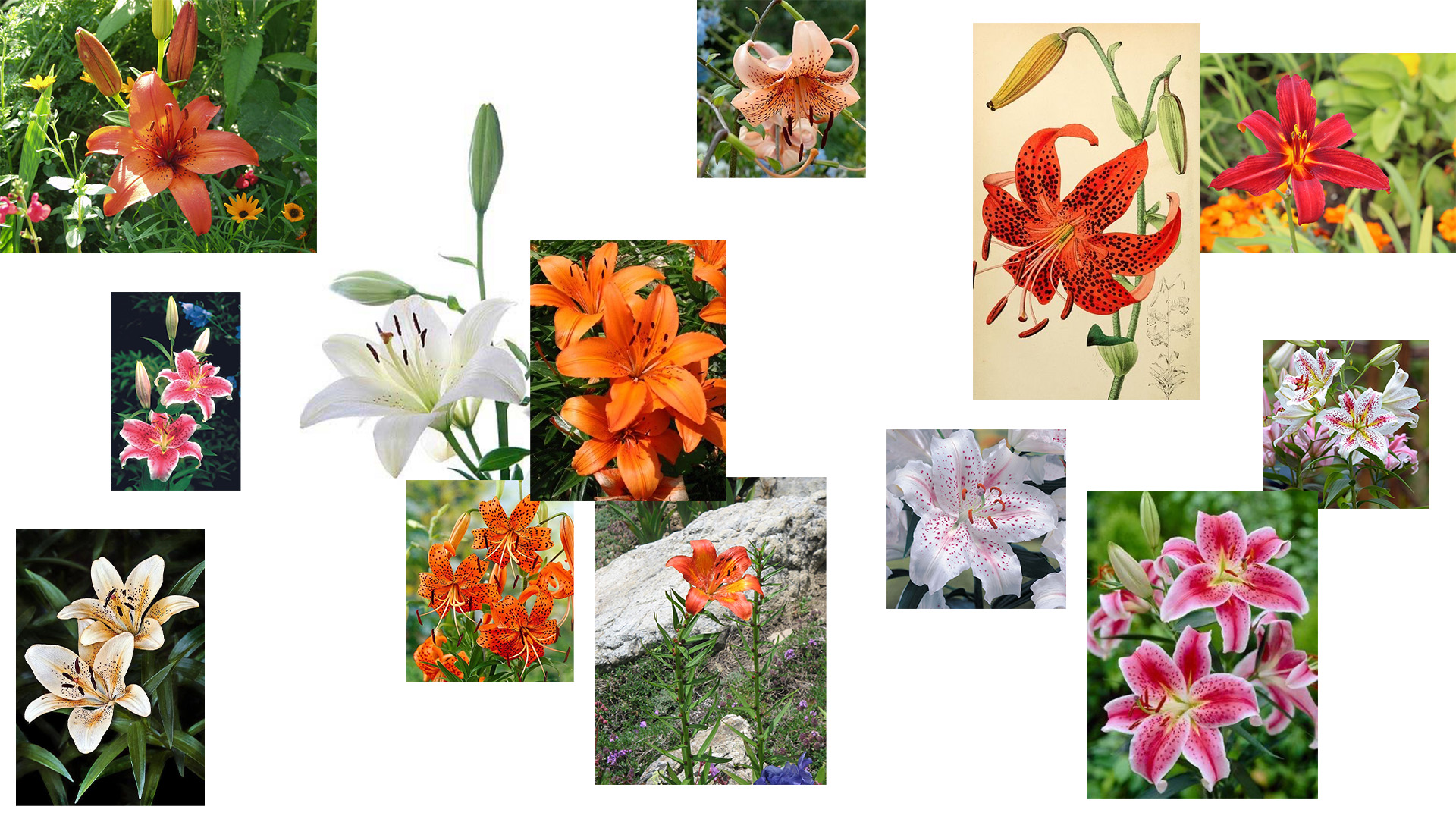
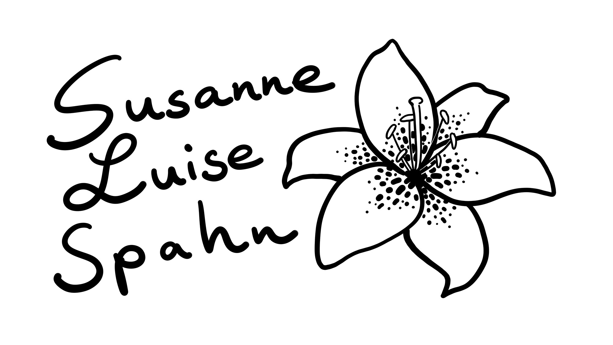
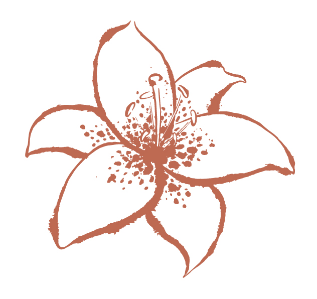
The name “Susanne” is of Elamite origin and means lily. This was the starting point for the brandmark.
After some research I started with drawings.
![]()
![]()
![]()
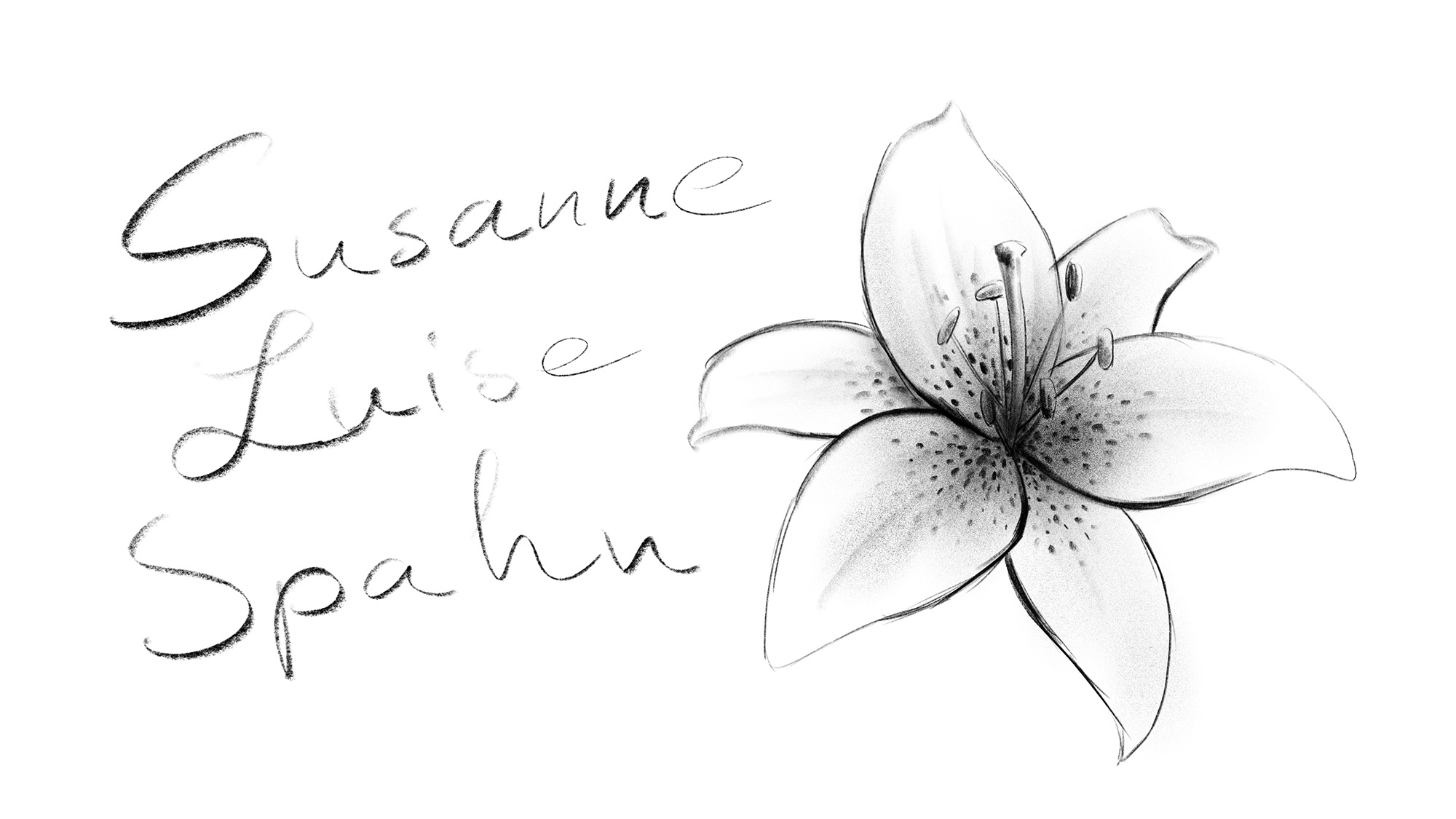
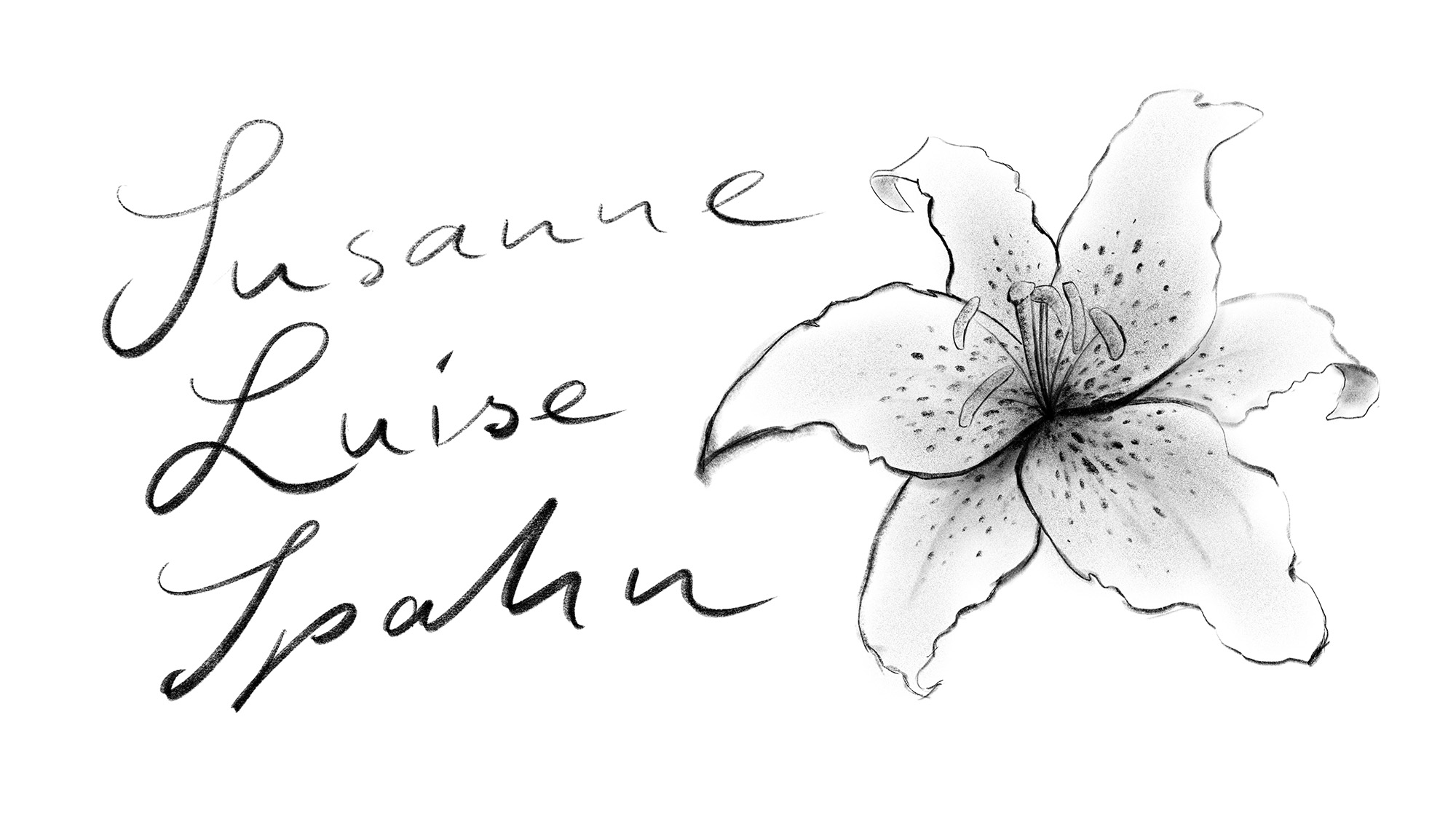

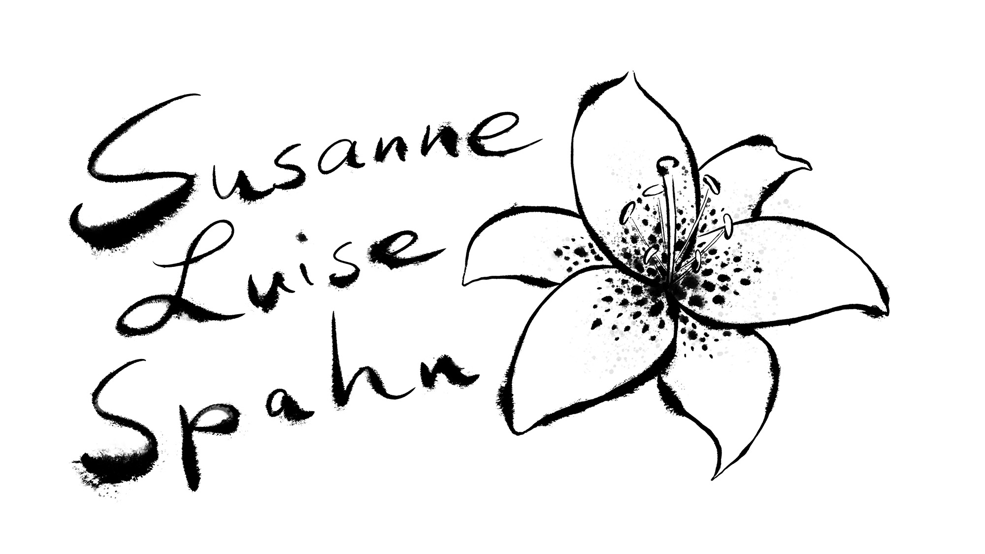
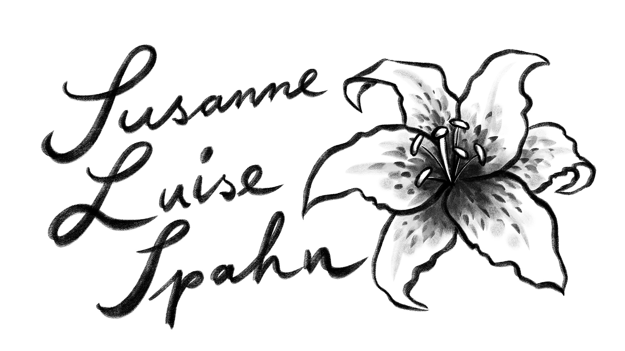
And I experimented with different handwrittings and differnt styles of rendering.
For the final Logo Design I did some alterings to the Garamond typefont to individualise it. And we decided to bring the lettermark and the lily blossom closer together.
![]()
Primary Logo
Primary Logo
White version to be used on colored background or photos.
 Simplified version of just the brandmark.
Business Cards
Coming soon.